Many restaurants are lacking in interactive websites that truly capture the beauty of their work. This can both be a strategy for creating mystery and allowing for menu flexibility day to day.
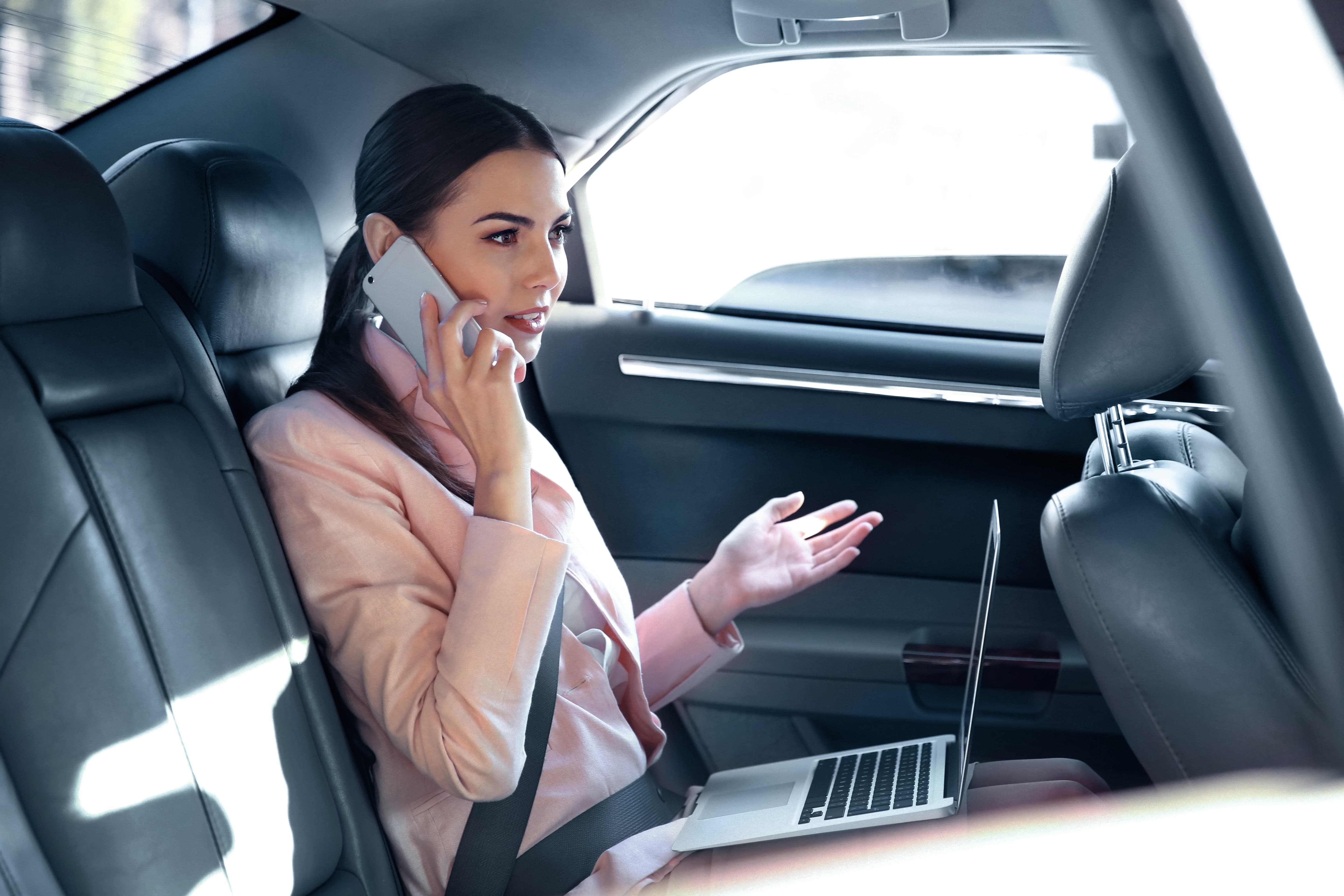
Since the pandemic the world of takeout has grown and even high-end restaurants have been forced to attempt new strategies in order to keep running their restaurants as normal.
Restaurant owners all across America are searching for new solutions to maintain or grow their business and we believe a strategy moving towards inclusivity will give them the best opportunities going forward.
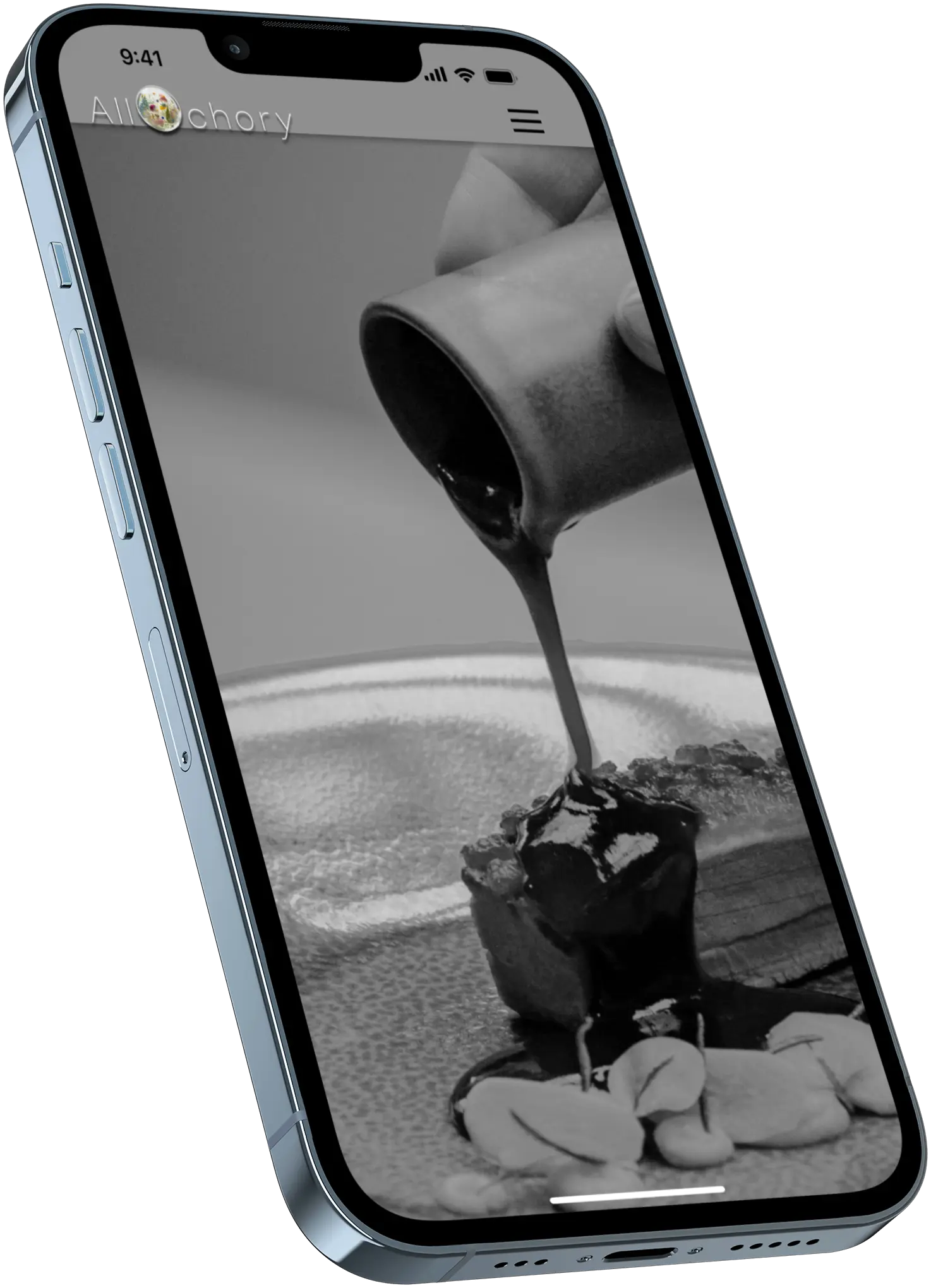
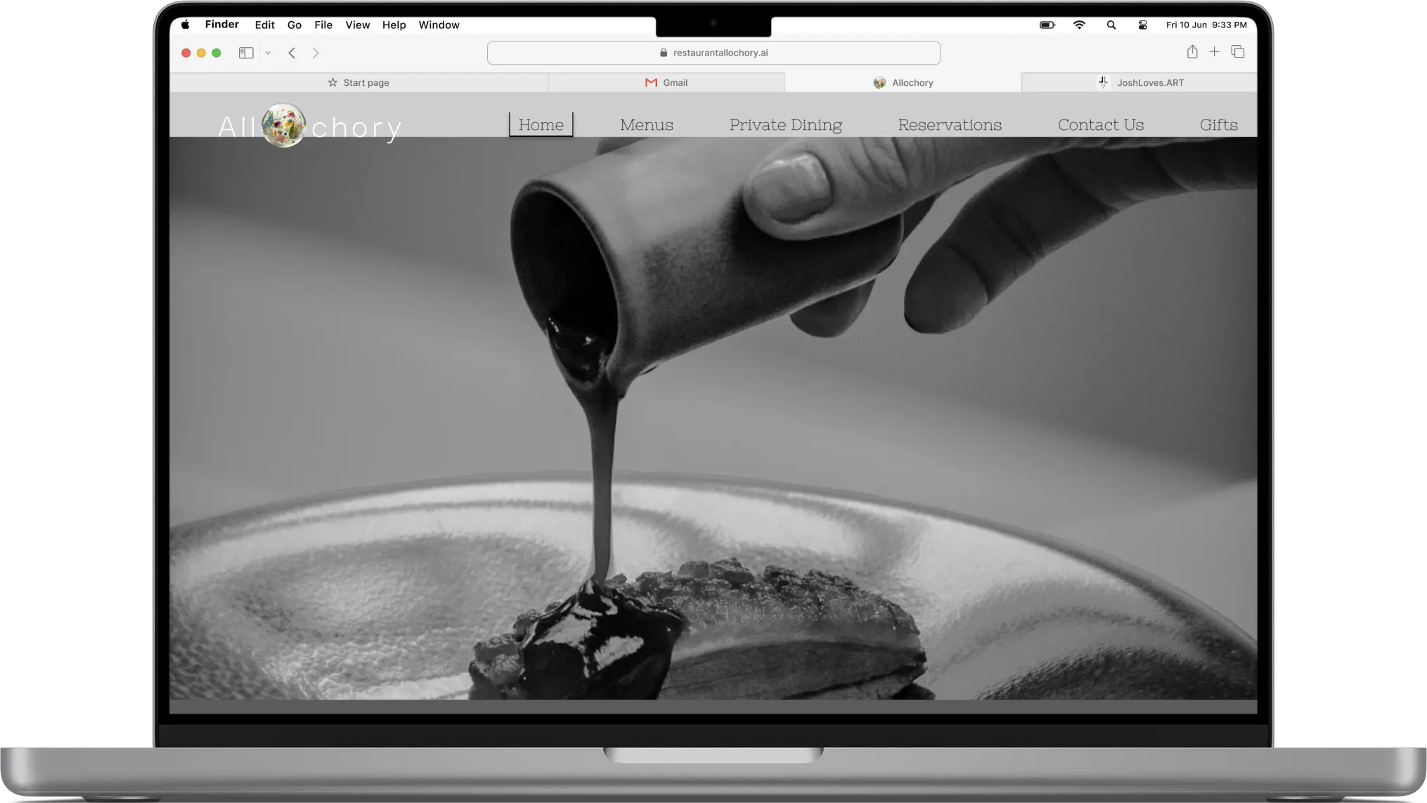
First priority is to focus on making the visuals front and center
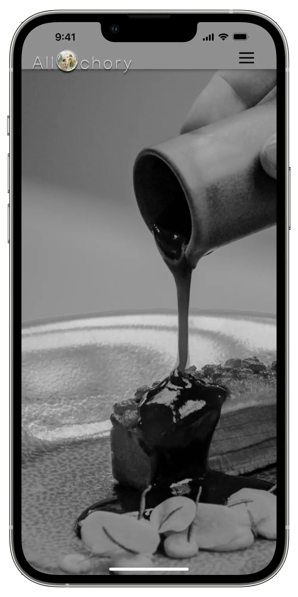
Ensuring that a sensory experience is achieved while at the website
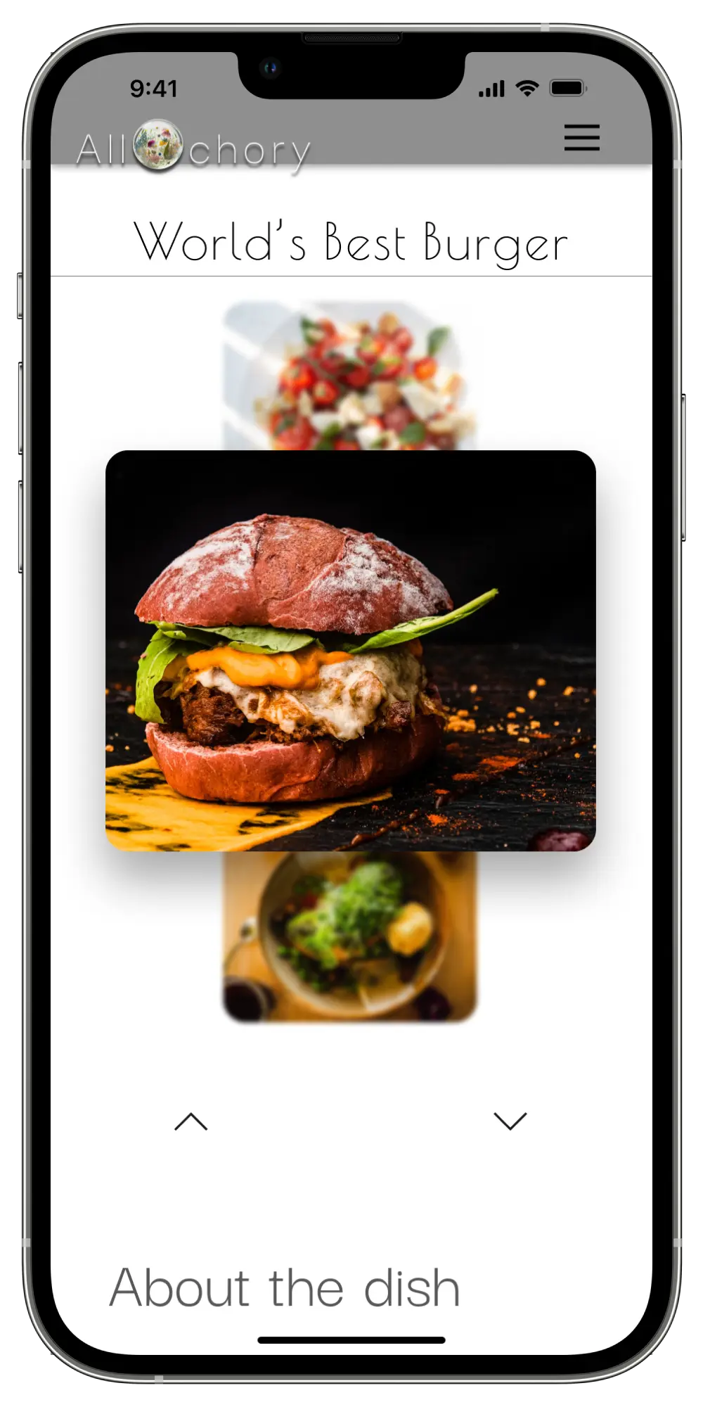
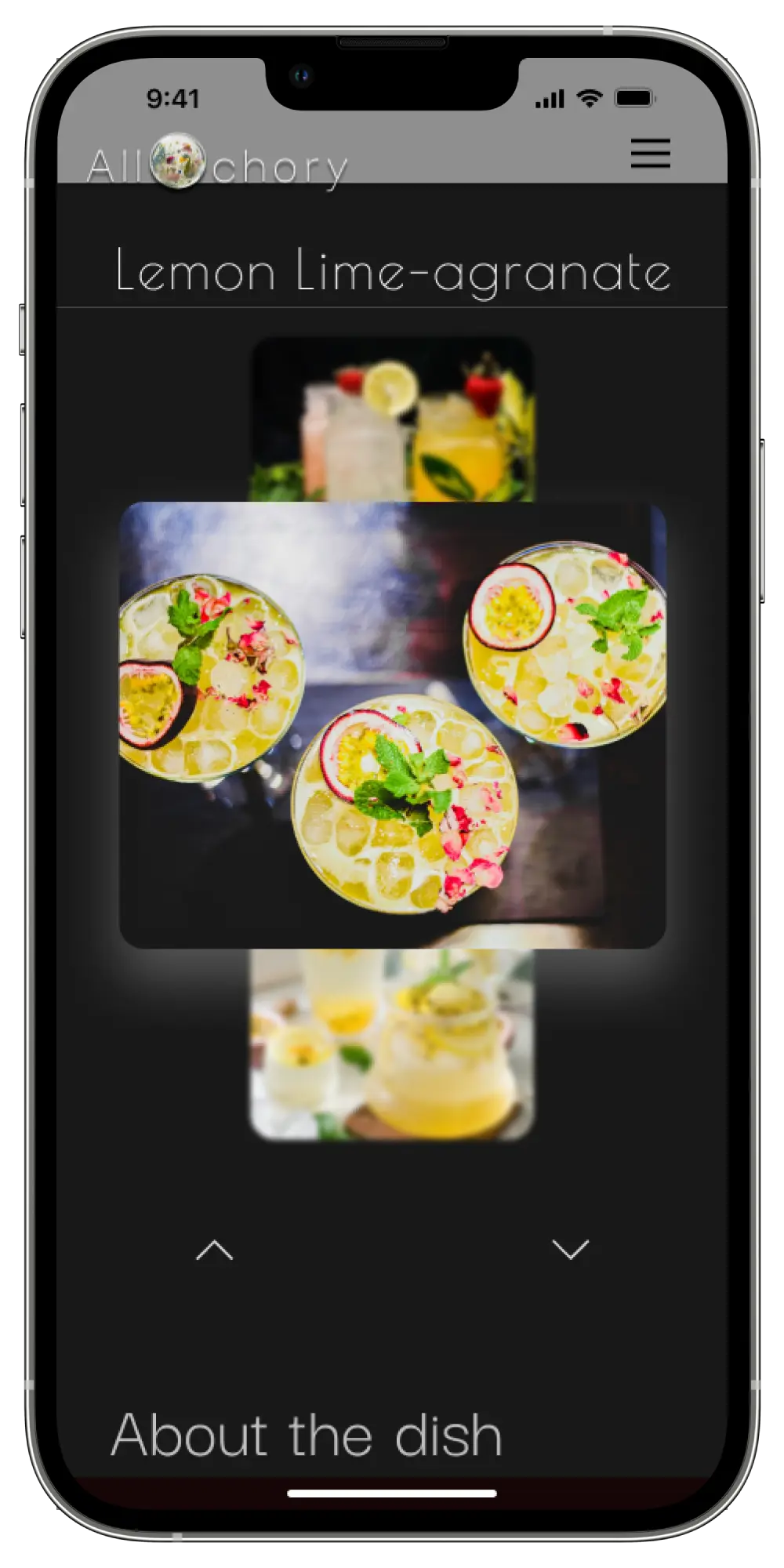
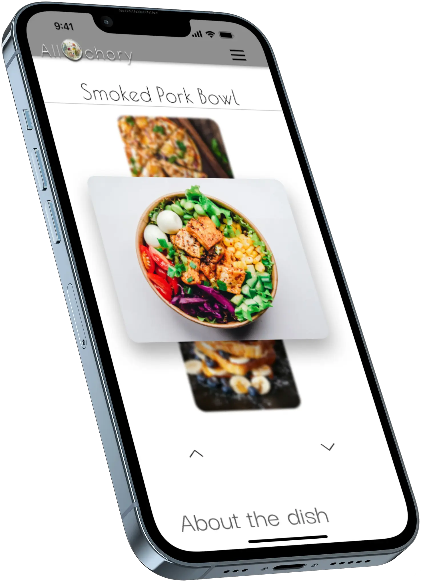
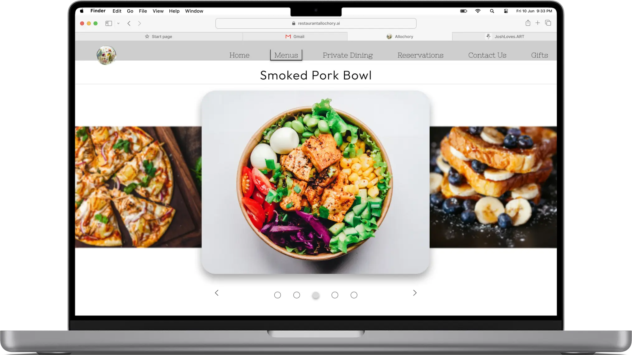
Making an interactive menu that can easily change the images of the dishes based off of preferences
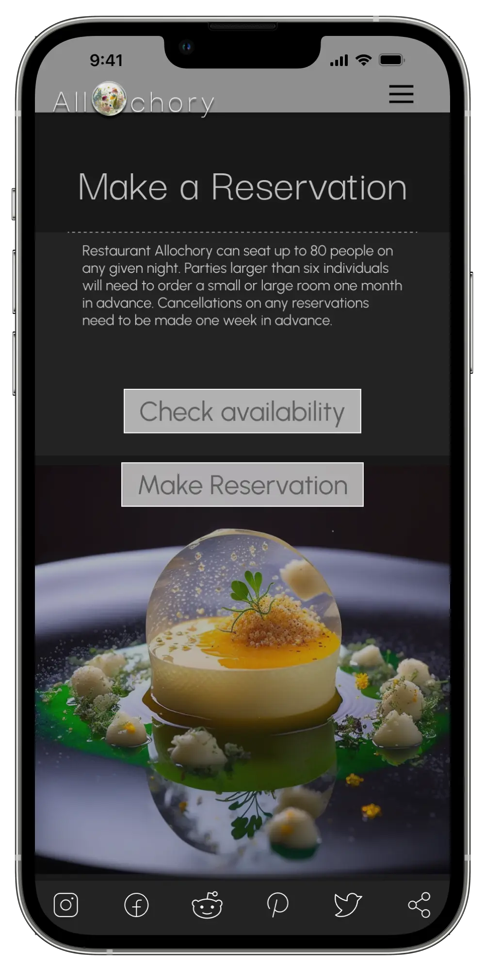
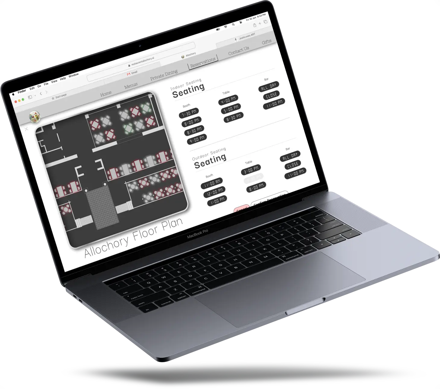
Customizable reservation option directly on the website
Making an interactive menu that can easily change the images of the dishes based off of preferences
Many users would prefer to go from google maps to one location that can serve all their purposes. These purposes are mainly understanding the quality and choices within the food, being able to book a table real time, seeing the type of food they are going to be consuming and if it’s going to be a nice experience. We used many research tools to pinpoint how we could make the user experience before coming to the restaurant and within the restaurant a more enjoyable experience.


Largest focus area is on the customers of the restaurant.
Second largest focus areas was making sure the menu was up to the chef's standards.
Third area of focus was making sure restaurant employees are onboard with the website.
Fourth area was to focus on accessibility and making sure the website is customizable.
Fifth area of focus is to make sure that both the restaurant and customers are satisfied with the end result of their interaction.
It can be challenging managing multiple reservations. Many websites do not give a great description of eating arrangements.
It can be a pain when you take your family or loved ones out for a special moment only to be sat in an uncomfortable location that doesn’t meet your needs. Interactive reservation options on the website could be an easy solution.
Not only do people want to make a smart choice they would like to make a quick choice.
Often times these quick decisions can be made when all senses are pointing towards ‘yes.’
With all this in mind, users want to be able to fill their senses up with choices. Seeing visuals, seeing descriptions, touching menus, smelling food. All can be achieved with a proper website.
All restaurants from Michelin star rated to food chains have menus. Every menu is often a bit different but all customers except a level of information that will allow for them to make an educated and invigorated choice.
Not only do menus have to be accurate they should also give the most amount of information necessary to make a proper choice on food.
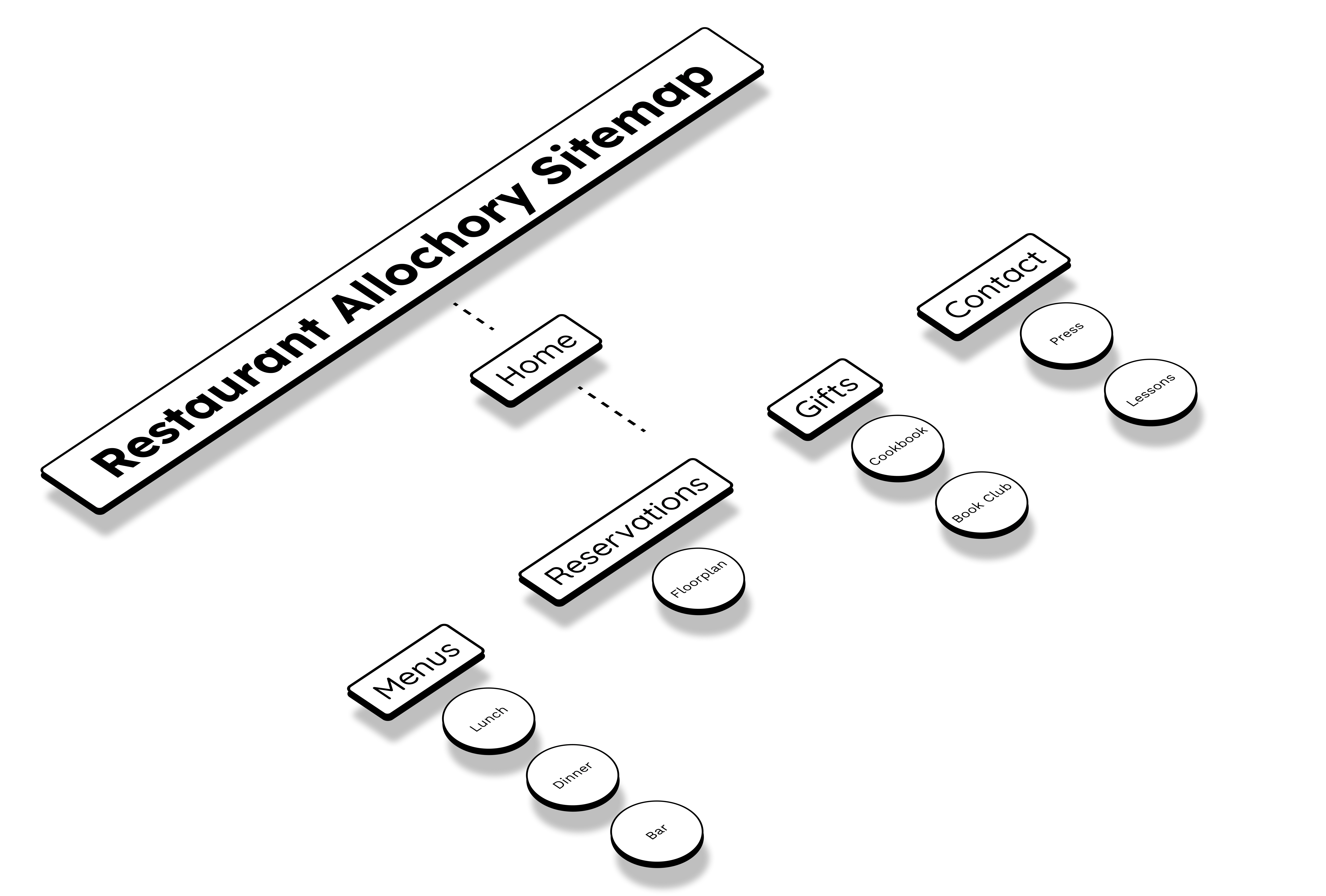
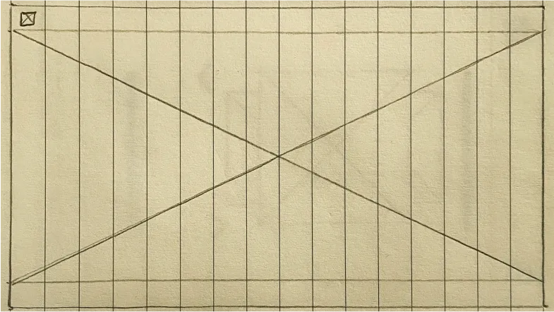
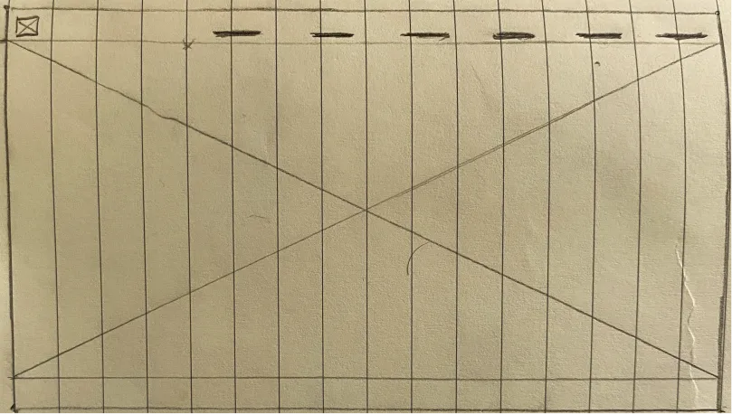
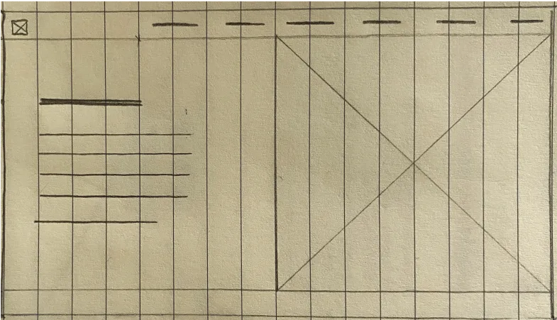
I created a sitemap to display a small section of the sites information architecture. The style of the site is a matrix so it is navigated in a way that doesn’t have an end goal. Keep in mind the main goal of this project was the menu, many of the other aspects I added to help give myself context during the design process.
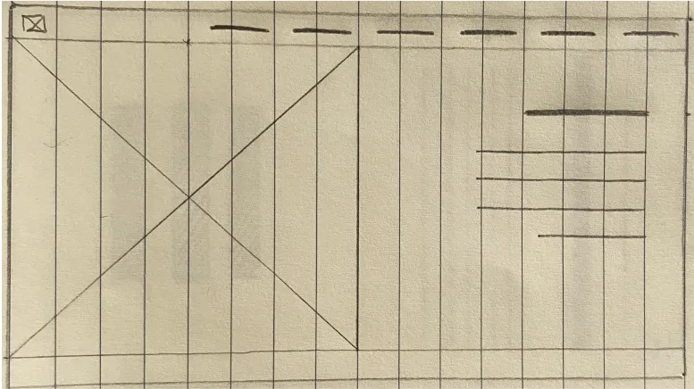
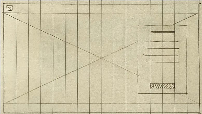
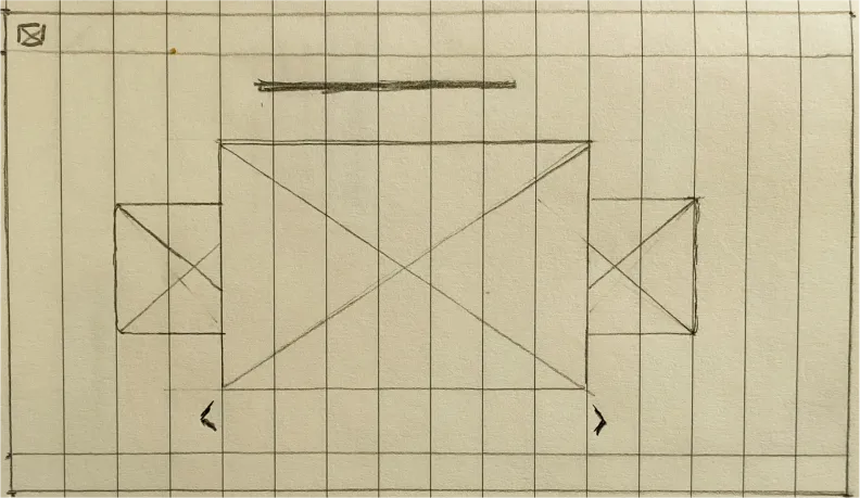
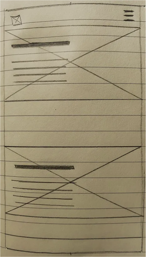
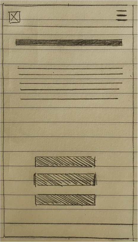
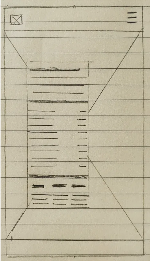
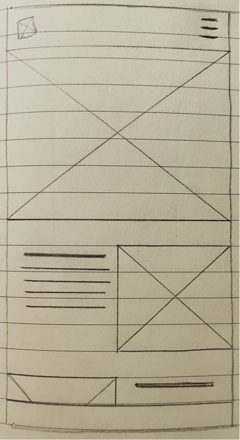
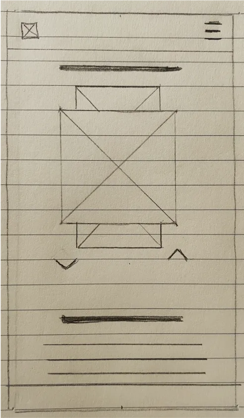


It’s important to put your wireframes into multiple different versions. This gives a nice foundation for understanding how to move forward with your design. My focus was on the the desktop and smartphone versions. This is mostly to give an idea of how to interpret the design.


Moving forward in the design process I transferred the paper wireframes into digital format within Figma. This allowed for a more advanced, but time consuming way of iterating. I continued to take into consideration our project goals and user research at this point.


After creating paper wireframes and and the first iteration of the high fidelity prototype it was time to test the creation with users.Within the usability study I asked five poignant questions to received optimal feedback regarding my next design choices.
What type of experience are you expecting when visiting a website for fine dining?
How important is you to see visuals of the restaurant and food before participating in a dining experience?
When viewing the menu what are the some of the elements that make you want to try a dish or experience the food?
What elements would you like to add to the floor plan style of reservations?
What feelings were you feeling when visualizing the overall layout of the website?
After creating the paper wireframes and digital wireframes, it was time to transition to the hi-fidelity mockups. These mockups are the ones that will be used for testing in the first usability study. I stayed true to the original form of the wireframes in order to stay consistent during the iterative process.
All of the fonts color contrast ratios achieve the highest of WCAG metrics. On all screens a contrast ratio of 7:1 is maintained allowing most all users to be able to read the information comfortably.
An interactive and animated floorplan is included to accessibly show the physical accessibility of the actual restaurant. Not all restaurants make it clear which areas are most accessible.
Accessibility consideration were taken in regards to the top bar and menu. The original design was not that accessible in terms of size and colors. I changed the button sizes and image sizes to make it more accessible and interactive.
All of the fonts color contrast ratios achieve the highest of WCAG metrics. On all screens a contrast ratio of 7:1 is maintained allowing most all users to be able to read the information comfortably.
An interactive and animated floorplan is included to accessibly show the physical accessibility of the actual restaurant. Not all restaurants make it clear which areas are most accessible.
Another round or two is needed of iterations before the design is completed I believe. I’m hoping to find some time to do another study that will be larger to make a few more design changes.
I would like to show the prototype to restaurant owners as I feel they may give more feedback relevant to what is feasible or not within the design. People that eat are easy to find, people that cook are a bit harder.